kt + e diy: the bathroom reveal
February 22, 2012 § Leave a comment
Finally! It seems we’re not only lazy with the actual reno process…I’m lazy with posting too. Sorry!
It is incredibly difficult to take pics in a bathroom. Such a small space…Also, this color is impossible. The picture above is the closest to real life. The wall color is really a coral-orange, but is reading more red in these photos and I don’t want to spend hours in Photoshop color correcting. C’est la vie.
The first step in this process was putting up the chair rail. This was intimidating on so many levels, but it is totally do-able. As long as you have a miter saw and a trusty level, anyone can do it. Caulk covers a lot of mistakes. Trust me. Besides painting and hanging everything on the walls, the only other real projects were installing the new faucet (see below) and the hardware on the vanity cabinet. When we moved into our house, none of the cabinets had hardware. Kitchen? No. Bathrooms? No. So strange to me. It’s the jewelry of a room. But I’d rather have to put up new than replace something nasty.
But I digress. I found this very difficult, but it’s probably because I didn’t really follow a process and ended up trying to put the drawer fronts on the wrong drawers…the installation of hardware itself is actually quite simple once you do the math. Yay math! #ilovesarcasm
The new light is an outdoor lantern and has a cute, cottage-y feel, which goes along with the mix of modern and vintage in the room. Outdoor lights are surprisingly much less expensive than interior light fixtures, Who would have thought? The mirror is an antique that my mom and I found YEARS ago and never did anything with. The actual mirror needs to be replaced, but that is something we can tackle in a few months when renovation funds rebuild. I really love the unique shape of the mirror and think it is so whimsical hung with the modern floating shelves.
I have been obsessed with the idea of a small stool with a wire basket and rolled up towels for what seems like forever. It is perfect for the small space and adds a little bit of storage that this bathroom desperately needed. On the wall above are two hooks so guests can hang their towels up to dry. I love this option because it took up less space and used the height of the wall better than a standard towel bar. Plus, hanging a towel on a hook is way easier than folding it over a towel bar. I mentioned we were lazy right?
All of the soaps and canisters and decorations on the shelves are from Home Goods, a great store to spend hours of time and hundreds of dollars. Seriously, it’s like Target. Try to get out of there for under $100.
The new faucet is adorable, but unless you know someone with plumbing skills (like my awesome dad!) this is a nightmare. It was sort of a nightmare even with someone with skills. The only saving grace is that it really looks beautiful and that makes the days – yes, days – of work worth it. The “hot” and “cold” written on the handles just kill me.
All in all, I am so pleased with how this room turned out. It is exactly how I pictured it, which hasn’t happened in any of the other rooms we’ve worked on. It is also the most complete of any room in the house, so maybe that’s why. The work was most definitely worth it and it really brings a smile to my face every time I walk past the door.
I’m not sure what we’ll tackle next…probably the lower level. I think we both need a break and doing this room next will give us time to recover, plan, and save money. This was a relatively cheap and easy cosmetic makeover. The lower level will not be. Also, our yard is going to need some serious work this summer (I think we have to paint the deck…ugh). Who knows, maybe we’ll win the lottery and I can redo all the things!
bathroom sneak peek
February 6, 2012 § Leave a comment
This bathroom reno is taking forever, A 30 minute HGTV makeover this is not. The extended timeline comes down to two factors: 1) we are not handy and 2) we only are making time to do things on the weekend. We are so unmotivated to work on this room during the week. Laziness? Maybe. Ok, probably. It’s sort of our MO when it comes to household chores and projects…
Anyway, here’s a sneak peek. I hope to have more to share with you after this weekend!
Pretty drastic, non?
kt inspiration: kate spade
January 31, 2011 § Leave a comment
As a designer, I find inspiration from many different places – other designers, interiors, event design, fashion, music, photography/fine art. But I really love it when I can find different facets of inspiration from one source. Enter today’s source: Kate Spade.
If I could have one person dress me for the rest of my life, it would be Kate Spade. Her “about page” says it all: utility, wit and playful sophistication. Her motto of sorts this year is “live colorfully,” which I love. It’s such a designer-y way of saying “live boldly,” or, “live passionately,” but it really speaks to me. Not to mention that each month this year, they will pick a new color to “live.” I really love it.
You could say I have a girl crush.
I noticed a week or two ago, this little treasure:
source: kate spade
It’s a little “book” on the site that is so adorably designed (how great is the magenta page with the ampersand? I would totally frame that.) It got me thinking about what sort of mood boards I could divine from the theme of “living colorfully.” I’ll post one board here, and present the others tomorrow. Just for giggles.
The first here is probably the most obvious when it comes to Kate Spade and what she designs, though it might be my favorite right now. Inspired by Miss B, I am feeling this urge to create a personal style for myself as an adult. Sadly, it’s time to leave college “style” behind. I’m purging what doesn’t work for me anymore, and only buying what feels right and feels like it is the clothing of the girl I want to be. This part is obviously very personal, as I know no one has exactly the same taste in fashion, but I love the playful sophistication (with a hint of Mad Men vintage) in this mood board:
source: kate spade and style me pretty
I love the simple, classic clothing mixed with bright and whimsical accessories like the colorful tights and enamel flower pins. The owl purse had me at hello. What I also love about this is that though some pieces are “on trend” (read: tights), most are timeless and perfect in their proportions, thus, can be worn and remixed for seasons without looking staid. So though I can’t afford Kate Spade (tear), I have begun to think about these looks as I shop. Most recently, I found this adorable blue color-blocked dress and bright, lemon yellow sweater that fit perfectly in this theme. Though not at the same time.
That might be living too colorfully.
Until tomorrow…kt
inspiration #5
May 12, 2010 § Leave a comment
Hi all,
Things are moving along here swimmingly (if only if would stop raining long enough for us to get back on our bikes!) Not a whole lot has gone on on the wedding front, mostly because we did so much so quickly in the beginning. Just odds and ends now; dj’s, ceremony music, table linens, bridesmaids dresses, hotel blocks … So it’s not surprising that lately my inspiration boards have been looking a lot more like this:
than this:
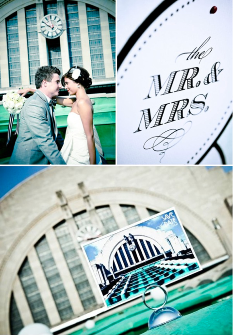
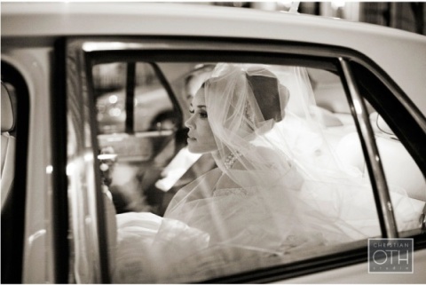
These pictures, by the way, are from my fabulous photographer who was featured on Style Me Pretty, a huge bridal inspiration blog. Awesome for her!
These inspiration images actually tie together quite nicely … they are very modern and clean in design, yet are full of unexpected pops of color and vintage pieces that make you smile. It’s the look that I’m really loving for my home design because it’s just so happy. It feels very well designed, yet it’s not so clean that it feels sterile and unapproachable and yet it’s not so comfortable that it’s full of overstuffed park-a-loungers (no offense if that’s what you love. to each his own. it’s just not me.)
ps- How cool are those striped plates?!? LOVE.
-kt
inspiration #3
January 27, 2010 § Leave a comment
As a designer and an avid tv watcher, one of my favorite shows is amc’s Mad Men. I can’t get enough of it (and now E even likes it too!) The story line and dialogue are witty, the character development is rich, and the visual are nothing less than stunning from week to week. No matter what darkness hides under the glamour of the time, the world of Mad Men is full of glamour, elegance, and that certain je ne sais quoi from the perfect little design elements of Don Draper’s office and he secretaries’ lovely wardrobes.
I recently found this inspiration board on The Inspired Bride and fell in love with its concepting based on this vintage appeal.
 Aren’t Don and Betty so pretty?
Vintage elements are very popular right now in wedding aesthetic, particularly from the ’50s and ’60s. There’s a certain charm and quaintness to these details that bring class to whatever part of the wedding a bride chooses. One popular element? The dress. How sweet are these?
I love the simple shapes of the dresses’ silhouettes. Another important aesthetic piece for the wedding? The cake. Look at these:
That last one is actually from one of the Mad Men actor’s real wedding! I love Christina Hendricks (aka Joan)!
To round out the vintage reception, here are some other bits and pieces that complete this charming look.
Fancy transportation? Check.
Reception decor details? Check.
Old-fashioned photography details? Check.
You’re all set. Have a swell wedding!


